
Chicago’s Design 50
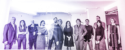
Photo by Joe Mazza
Despite the portrait of me in the piece (possibly the most unintentionally sad snap ever), I am very honored to be included in this list of designers in Chicago. Happier still that the definition of designer seems to be expanding.
Here’s the full article.
Recursion
I am dying to write in-depth about the Forbidden City virtual world project I’ve been helming for the last few years. Alas, that must wait for the launch itself.* But. We can talk about it obliquely, no?
There’s a scene** in the Virtual Forbidden City in which a painter sits in a garden with the imperial family, painting away. It’s a simple thing, really, but I find it immensely thought-provoking. As a visitor you’re an unseen spectator of the painted depiction of a moment in a world which is itself the depiction of a moment of daily life in a virtual milieu. A snapshot (which your avatar can take) would reveal a recursive scene-within-a-scene or, in the lingo of the art world, a mise en abyme — a technique used for centuries in all manner of paintings, woodcuts, and tapestries.
This got me wondering if there is any historical analog to the depiction of artists themselves inside the frame of the same scene they are painting. Cursory searching and lazytweeting yielded no actual term for such a composition, but in fact there are precedents.
Maybe the most famous is Las Meninas by Diego Velázquez. The work shows the painter (on the left holding a brush, duh) but also situates the viewer (that’d be you) as the object of his gaze. In other words, just looking at the painting you’re role-playing royalty.
Even more interesting is the mirror in the back of the room which reflects the royal couple (the true subjects of the painting-within-a-painting) — or which may simply reflect the canvas itself. In either case the viewer, while unseen, is a participant in the space.
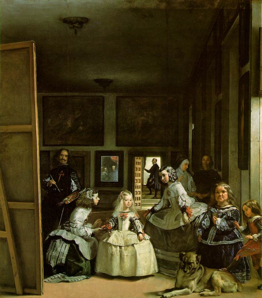
Diego Velázquez, Las Meninas
So there it is folks. Diego Velázquez pretty much nailed the lure of virtual worlds in a painting 352 years ago.
- Transcend viewing; embrace participation. (Even if, in this case, it is implied.)
- Fictionalize the first-person. (Nerdspeak: permit the possibility of role-playing.)
- Engage the viewer/participant by telling stories mid-story. (What the hell is that guy doing in the doorway? And why is that kid’s foot on the dog? And, the midgets?)
Scrolling forward a few centuries we have Mark Tansey, an artist smitten with the contrast between the static moment and the dynamic (lengthy) process of painting itself. Tansey’s Action Painting I and II place the artist in a position that only a photographer could capture, depicting a moment of catastrophic energy as if it were just another still life of fruit.
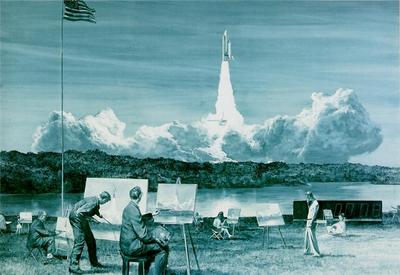
Mark Tansey, Action Painting II
See also the first Action Painting.
In the Virtual Forbidden City the painting scene is, essentially, a still life of the imperial family, but the fact that your viewing position is unlimited — you can walk around it, into it, or stick your nose right down onto the painting — speaks to both Velázquez’s and Tansey’s focus on the observer rather than the observed. This, to me, is the promise of virtual worlds. And something I hope we at least approach, if not achieve, with the VFC.
Of course the piece-de-resistance (artspeak, yes!) in this vein has got to be Robbie Dingo’s unbelievable recreation of Van Gogh’s Starry Night. I remember when we were building the prototype of the VFC in Second Life. SL, like many virtual worlds, is built from within, by avatars, moving primitive shapes like sorcerers. It was a striking scene being inside the world watching as walls were moved around, tweaked, textured and placed. Truly living inside the process of a painting.
If you’ve not seen Dingo’s video, do yourself this favor.
Phew, I made it. That was oblique enough, yes?
* And it must wait even a bit longer now. Eagle-eyed viewers of the site may have noticed I slyly changed the date of the project launch in the sidebar from “spring” until “fall” of this year, rounding out my involvement at a cool 4.5 years. Egads that’s a long time to work on a project.
* * Scenes in the VFC are basically looping historical tableaux that a visitor can approach on the grounds of the palace. Distinct from an activity which permits interaction.
Vinicolor
The idea: use red wine to make a watercolor painting.
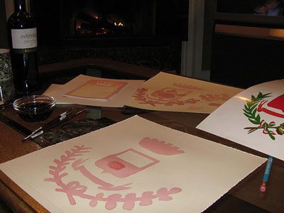
Why is this concept art?
A) Because what I tried to paint was the town seal of Barile, my great-grandparents’ home town in Italy
B) Because the wine is Aglianico del Vulture, grown in and around Barile, from the winery of the Paternosters, our distant relatives
C) Because the paper is from Amalfi, Italy, waypoint on our trip this summer
D) Because I am an awful painter, but the concept is quite good
E) All of the above
It can be done well — as this site, where I got the idea, shows.
The thing is, wine is a tough medium. Each time you put the brush to the paper, which in this case was 100% cotton, the wine dab pooled momentarily and then chose the rivulet of least resistance and poured into it. More topographical analysis and fluid dynamics than art, really.
Kinda makes a nice Rorschach though. Do you see an iPod?
Making CD’s
So the annual holiday mix is about ready to go out. Shortly I’ll post the specifics on this year’s compendium, but for now a few tips having spent so much time in the Jewelboxing system putting it all together.
Warning, this is niche advice. Meaning, this might apply to one of my two readers. Really I’m posting this as Google fodder for future readers. A time capsule of advice, if you will.
If you use the Jewelboxing system you’re no doubt a fan of the simplicity and flexibility of the templates and the DIY construction of the cases themselves. Having made several hundred of the cases over the years I’ve come to the following conclusions.
- It is much easier to label the CD’s once you’ve set them in the case on the spindle. This holds them still while you apply.
- When ripping the perforations on the STtray sheet it is much easier to rip it latitudinally (the long side) first, then longitudinally.
- Those crazy tiny diagonal perforations near the hinge? Cut them with a small pair of scissors. Much easier than ripping them.
- Once you’ve printed the booklet inserts it is best to put stack them into 10 or 15 or so and weigh them down overnight with something heavy. This flattens them out so they sit in the tray better.
- When folding the edges of the STtray sheet (the parts that are at 90 degree angles to the tray itself) it is best to fold them at an angle greater than 90 degrees so that on inserting them into the tray there is resistance against the case wall. This makes for a tight fit and usually prevents the spindle tray from ripping the paper.
- Lastly, if you are putting anything in the hinge chamber don’t forget to rip off the little rectangle of paper that would normally be the spine. If you don’t, you won’t be able to see into the chamber edge-on.
And now to confirm the obvious: yes, I have spent too much time putting these suckers together. I need to go play in the snow.
Museum-as-website
Paul Bausch makes some good points on why museums should be more like today’s web. What’s interesting is that the spark for the post came from an expectional interaction with a human tour guide.
The tour included a stop at a recreation of an 1800’s store run by Chinese immigrants. As you step inside you see lots of stuff that would have been for sale at a store like this, Chinese newspapers and inventory lists from the period, and an audio track playing with people speaking Chinese. Someone in the group asked what the people were saying on the audio track, and the tour guide launched into a story. It turns out he’d had several Chinese speakers on previous tours, and he’d started to piece together what the audio was. Apparently, the museum curators had recorded a mahjong game in progress, and audio in the store was simply some people sitting around playing a game and having a conversation. Most museum-goers in Bend, Oregon would never know what exactly the conversation was about, so it didn’t matter that the audio didn’t faithfully recreate an 1800’s Chinese store.
I was struck by this little exchange, because the tour guide had gone from adding a layer about the exhibit to a little behind-the-scenes information about the construction of the exhibit. And the information hadn’t come from the museum curators, it had come from fellow museum-goers.
Along the way, I noticed other types of information the guide was relating such as trends. He’d say, “everyone always asks about this piece of equipment right here.” And then he’d explain what that was. He was using audience patterns to tune his presentation.
Bausch isolates the characteristics of a great interaction with a knowledgeable human guide and expresses them in terms that sound like what the web does very well: deep info, layered perspective, visitor trend analysis. Many museums have tried to make their physical experiences more interactive, of course (see here, here, here and oh yeah here), but the holy grail of a physical space as malleable and two-way as the web has not been achieved. My team refers to such as a space as a “flexhibit,” but it is more concept at this point than reality.
It is curious that Bausch suggests we use technology to do what the best human guides already do. I can hear a museum director arguing the reverse: that what we really need are more human guides that synthesize info and have a depth of knowledge that equals the best websites. That’s a solution that doesn’t necessarily scale, but then scalability has been the biggest obstacle to making museum exhibits technologically interactive. (Gotta wait in line to punch that button for more info on the wall.)
It’s a tough problem actually and it is complicated by the fact that many museums (like traditional encyclopedias) operate as keepers of culture rather than sharers of it. People can write really informed articles for Wikipedia, but replicating the experience of a museum collection without access to the original material history at your disposal is tricky indeed. Yet we have to try. It isn’t really a cabinet of curiosities if you can’t open the cabinet door or doesn’t make you curious, is it?
I don’t think the solution is standalone kiosks or “information hubs” per se, though they may be part of the solution. The most interactive museum spaces will in fact mimic the best websites as mixtures of superb technology and human community — and that community should necessarily include human guides and docents such as Bausch encountered. What we want is technology that facilitates interaction with humans and with the knowledge embedded in the material history contained in the museum.
Zodiac desktops
I’ve been looking for a good desktop background. But not just anything. Over the years I’ve formed fairly strict requirements.
- Usable. Not sure who first said “wallpaper makes bad stationery,” but it was my guiding principle. Backgrounds need to be easy to work against, contrasting highly with the folders and files that live on it. Photos of children, hot rods, and (sigh) rocket ships generally don’t offer this.
- Widescreen. 1680 x 1050.
- Constrained variation. I wanted the ability to change the background periodically but with some consistency from image to image.
- Cool-looking. Understated references to various aspects of my geekiness score highly.
Well, I found the source material in this amazing collection of images from A Celestial Atlas by Alexander Jamieson published in 1822. The last point was satisified first. These pages are beautiful, simultaneously astronomical and mythological, information design and storybook. But the best part is that they are a calendar sequence tracing the motion of the starry sky over the course of a year — perfect for changing desktops. In order to satisfy requirements one and two I had to do some modification. Inverting the colors immediately produced a pleasant white on blue that blueprintized the prints satisfactorily. Then I reduced opacity to 15% to make contrast with desktop elements generous.
It’s probably no coincidence that I am captivated by these images given my immersion in Tufte’s Beautiful Evidence right now. He makes a great case for the multi-layered beauty of astromonical graphics.
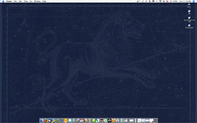
You can download the modified images here. (All 1680 x 1050.)
♈ Aries
♉ Taurus
♊ Gemini
♋ Cancer
♌ Leo
♍ Virgo
♎ – ♏ Libra – Scorpio
♐ Sagittarius
♑ – ♒ Capricorn- Aquarius
♓ Pisces
Also, all in a single zip (8 MB).
There’s always room for improvement of course. I have five displays on my desktop. Ideally they’d all share similar backgrounds that stretch horizontally from one to the next. You could do this with the astronomy prints (stitching the ecliptic into a continuous Mercator armillary across the displays), though only one machine would ever be correct to the current month.
Also, does anyone know if there is a way to have iCal.app schedule desktop image changes?
The a-ha! moment
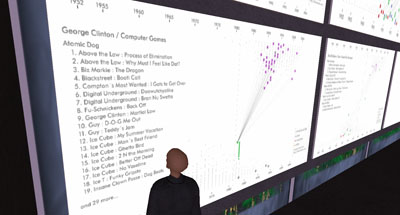
Above, last night’s opening in Second Life of Jesse Kriss’s History of Sampling visualization (SLURL: Ars Virtua New Media Gallery).
A few weeks ago I moderated a panel of artists and technologists at the Aldrich Contemporary Art Museum whose aim was basically to complicate the distinction between the two categories of panelists. It was a great disussion in a superb environment: the Aldrich is a first-rate, forward-thinking museum in Ridgefield, CT, a place you’d never expect it. The germ of the discussion was creativity. How are technical creativity and artistic creativity — “innovation” to be buzzword-compliant — related? Are they analogous? If so, where do the similarities break down?
We stacked the deck a bit by involving technical folks whose work was clearly artful and artists whose medium was heavily technologized, but the audience itself, also involved in the discussion, were from a wide range of both backgrounds. The goal of the day was to try to isolate, such as possible, the moment of inspiration — the moment when you knew you had something worthwhile. How did this come about? Almost everyone said the idea came first and only then was the tool sought to make it real. One of IBM researchers said that if he could perform his complex visualizations with a pencil he would.
This surprised me. One of the great things about technology, it seems to me, is its extensibility in ways not intended by the designer. I figured both groups would see this as inspiration in itself. The artist, perhaps not understanding fully the capabilities of a digital tool, cajoles (even breaks) it in unique ways — while the geek, knowing intimately the capabilities of a particular tool, hacks or applies it in unique ways. Admittedly tool-inspired creativity is only one route, but no one on the panel seemed to put much stock in it. Maybe I’m wrong, but can I be the only person who has loaded an application and thought “Gee, I’d love to make it do X.” The creativity, in part, comes in making the tool behave “improperly.”
The panelists were a great bunch. See for yourself.
See also Geeks in the Gallery, unrelated to the Aldrich event but very relevant to the discussion.
How to create a LEGO mosaic
UPDATE: the kids have created a business based on this idea. If you’re interested in having a mosaic made from your photo, please visit www.thebrickbrothers.com.
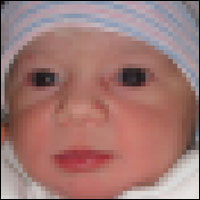
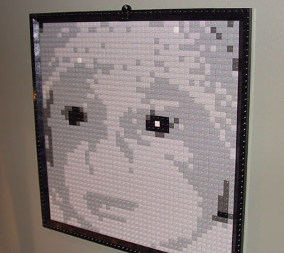
When my oldest son was born in 2001 LEGO offered a cool online “Brick-o-lizer” that would take an uploaded photo and turn it into a five-tone grayscale grid of 1×1 bricks from which you could create a wall-hanging mosaic. LEGO would send you the exact right amount of bricks in bulk. Putting it together was as easy as paint-by-numbers. I did this for him and for his little brother in 2003.
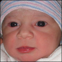
My daughter was born a few weeks ago and so naturally I went back to the Brick-o-lizer to create her mosaic. Imagine my horror to find out that it isn’t available anymore. How could I deprive my baby girl of her LEGO mosaic? Well. Obviously. I couldn’t.
So, here follows instructions for doing it manually in Photoshop. (But before we begin, let’s be sure to acknowledge the unbelievably talented people who create LEGO mosaics in full color without a grid at all. I bow to your supremacy.)
First, prep your shot as a square. For portraits, tight in is best. People will naturally view your mosaic from a distance or squinting to maximize contrast so details external to the person in the portrait will be lost (and a benefit-free pain in the ass to snap into the LEGO grid for you).

Change the photo to Indexed Color, select a Custom palette, and choose six shades of gray. The easiest way is to click on the grid and then when the color palette comes up choose Web colors only. Select white, black, and then a light, medium, and dark gray.
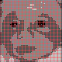
In Preferences > Guides, Grids, & Slices set the Grid to a prominent color, gridline every 10 pixels, and subdivisions 1. Turn on a grid with View > Show > Grid.
You’ll need to do some manual computation. The grid is 44 x 44 which is 1,936 bricks. Eyeball or, if you prefer, count as many of each of the five colors you will need.
You’ll then need to go to the LEGO shop and order the bricks.
You’ll need one X-Large Gray Baseplate , one set of 2×4 Roof Tiles Steep Sloped Black, one set of Black Roof Tiles 25° (2×2, 2×4, Corner), and then as many 1×1 Studs in White, Light Grey, Medium Grey, Dark Grey, and Black as you need.
Once it all arrives, use your gridded Photoshop image or print it out and enjoy a few hours of mind-numbing bricklaying.
For a good time, call 877-454-0795
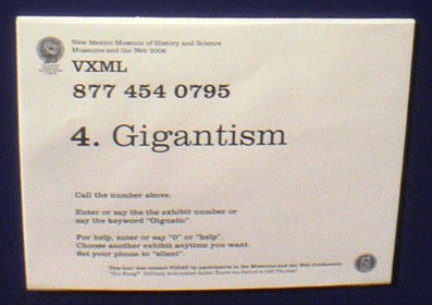
The annual Museums and the Web conference held its opening reception at the New Mexico Museum of Natural History in Albuquerque two nights ago. The dinosaur exhibit — which is to say, most of the museum — featured a cellphone-based tour in two flavors, keypad-activated and voice-response. All you had to do was say the number or name of the exhibit and voila! But here’s the key point: the tour itself was put together only hours earlier in a conference workshop by museum professionals, podcast-style. This is really quite revolutionary since it shows a real speed-to-market (so to speak) and flexibility of audio tours that previously had not existed. Guerrilla museum tour creation. Yet another example of the web experience for content creators and visitors infiltrating the physical museum space. Wonderful!
And don’t forget to say “Gigantism.” Not only because it triggers the audio, but because it is a lovely word.
The Ampcamper

How I hauled myself, two teens, an 80 lb dog, and a whole load of crap 4000+ miles across six states in twenty days using an electric vehicle. And survived to tell the tale.
The Terror Tourist
Episode 1: The Ghosts of Colorado
A roughly monthly exploration of places in horror fiction — real or imagined, geographical or psychological — culled from The Heavy Leather Horror Show podcast and sent to your inbox. Subscribe to the podcast and/or the newsletter.
Views From The Tank

Coral and fish photos, water chemistry data, and notes on home reef-keeping. Dive in.