
The Mashability Index
A while back my brother gave me several thousand songs from GoodBlimey.com. Almost all the tracks were mashups. Each song was composed of two songs by two different artists fairly equally smooshed together.
All the track titles were in the A vs. B format (e.g., Black Eyed Peas vs Kraftwerk) — and this gave me an idea.
I exported all the track data as a text file. Then my pal Chris Gansen wrote a script that nuked everything except the two artist names for each track and transformed the data into a spreadsheet like this:
A B 1
A C 1
B D 1
C D 3
C B 2
…
Then it was just a matter of plugging the data into ManyEyes and playing with the visualization types. The best by far is the bubble chart view. (Here’s the interactive chart.)Where the first two columns were artists names and the third column was the number of times they were mashed together in unique songs.
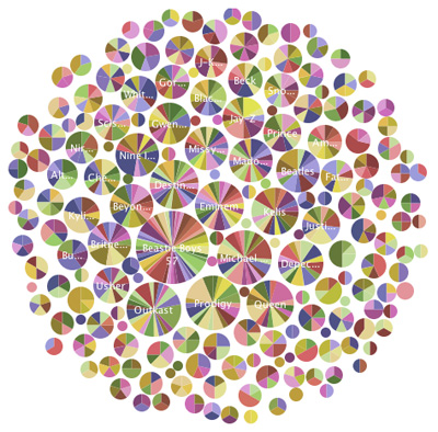
Each circle above represents a single artist. The larger the circle the more other artists the selected artist is mashed with.
The color slices actually tell you at a glance which other artists have been mashed … if you are an autistic savant who can pick out a single color in a sea of several hundred chromatic gradations, that is.
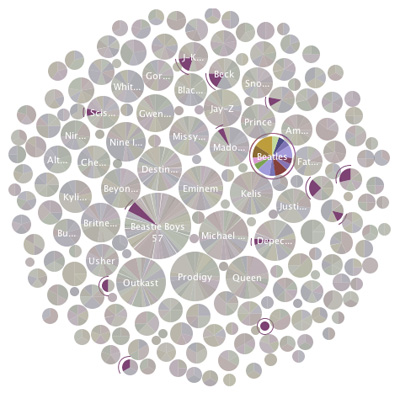
Much easier is clicking a circle which highlights the other artists with which it is mashed.
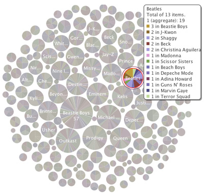
An alternate view gives the most complete information complete with number of mashed tracks per artist combination.
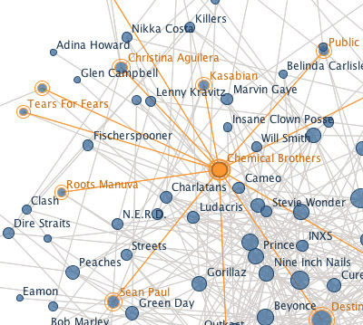
One other useful view was the network diagram. It shows actual connections between artist combos. The best feature of the diagram is that selected nodes highlight all the other artists with which it is matched. Easy to figure out who’s connected to whom. (Here’s the interactive diagram.)
So what have we learned? Certainly my data set does not contain every mashup ever made. But there were thousands and I think the charts give a good sense which artists mash best (look for the big circles) and mash best with whom.
But there’s far more that could be done. For one, there’s no data in these charts on which songs are being mashed. I have the info — just haven’t figured out how to integrate it. What I really would love to get at is why two artists make sense together. This would require stylistic data, notoriously subjective and consequently unreliable. Still, consider this but a start of the analysis.
Two particular projects influenced my work on this index. The History of Sampling by Jesse Kriss is a bar that I didn’t even come close to hitting, but it provided a great place to aim. And Andy Baio’s analysis of the samples in Girl Talk’s Feed The Animals showed what could be done with an idea, Amazon Turk, and some cool visualizations.
In truth, getting this data into shape was a massive pain in the ass. It was horribly formatted to begin with and took a great deal of kicking and shoving to play nicely with Many Eyes. Above all thanks to Chris — but Jesse Kriss, Frank Van Ham, and Martin Wattenberg of the Many Eyes team deserve applause too.
This is a lot cooler than My Music Genome, isn’t it?
One response to “The Mashability Index”
Mission Elapsed Time: 20:00:21:06:42:40

Recently this blog (and my Flickr account) turned 20 years old, forever in Internet years. I went back through it all, retracing digital footprints made on what feels like a different planet. Here are some highlights.
The Terror Tourist
A roughly monthly exploration of places in horror fiction — real or imagined, geographical or psychological — culled from The Heavy Leather Horror Show.
Subscribe to the podcast or the email newsletter or just read through the archives posted here.
The Ampcamper

How I hauled myself, two teens, an 80 lb dog, and a whole load of crap 4000+ miles across six states in twenty days using an electric vehicle. And survived to tell the tale.


Forget the Forbidden City and Ghana. This is what you should be spending your time doing! I absolutely love it, have just spend half an hour exploring your Many Eyes visualisation.
Wired had a nice visualisation of the samples in Girl Talk’s, “What It’s All About”. Actually, you should send yours to Wired, I bet they’d publish it.