
Recombinant design
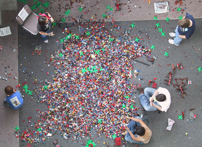
SXSW 2006 Interactive Playpen. LEGO wonderland. Aerial Rorschach.
Meet the Friendlies
China recently unveiled the sporting event pictograms for the 2008 Olympics. I’ve been a fan of these little icons since Australia somewhat amazingly created one for each sport using little more than boomerang imagery. Athens continued the trend of using culturally-specific imagery in the pictograms by styling each event icon as if it were found etched on the side of an ancient amphora. (What, Plato never played ping pong?)
But China has gone further, entering the realm of the awesome and bizarre. Meet the Friendlies. The five main mascots — Beibei, Jingjing, Huanhuan, Yingying and Nini — are endearing and meaningful (spelling out “Welcome to Beijing” among other things). It can’t erase the horror that is the Whatzit mascot from the Atlanta games, but it helps.
Their cuddliness is deceiving, though. The actual sport pictograms truly kick ass.

From left to right that’s the Modern Pentathlon, Taekwondo, and Shooting, also known as Plunder, Uppercut, and Make My Day.
More on Olympic pictograms and logoing:
The Graphic Design Olympics
A Mini History of Olympic Pictograms
Logos and Mascots
Motorcycle Giger
Interesting figurines of sci-fi movie characters made completely from motorcyle parts. Alien, Predator, Robocop, and Dragonheart. Full size at Flickr.
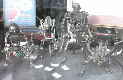
(Shop near Lincoln and Newport.)
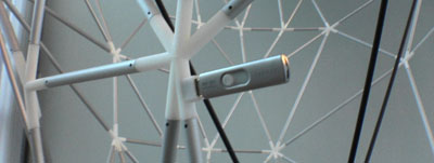
Lingualism
Real time translation in a conference setting always amazes me. The translators in their claustrophobic boxes have to keep up with nervous, mumbly presenters whose language is often specialized or vague. I try to make it a point to thank whoever has the misfortune of translating me. But it is such a great service. Sometimes I think about how life-changing it would be to have this device all the time. I have, in fact, walked out of a conference hall with the headset on and momentarily forgotten that it is not a Universal Translator that will work anywhere. Darn.
The movie The Red Violin is the first I have seen that moves smoothly and rapidly between many different languages, five in this case. Just when you’ve disabled the subtitles in an English section you’re thrown back into German or Chinese and you have to turn them on again. Thankfully toggling DVD subtitling, especially on a laptop, is painless. (Though it would be nice to be able to say “if any language other than X is being spoken I need subtitles.”)
Which brings me to website design. Multilingual sites — which should be every site but for obvious practical reasons cannot be — must work just as the translator headset or as DVD subtitles work. There should be complete symmetry in all languages and minimal design variation so that a lateral flitting from one to the other is seamless in every regard, except that the language changes — just like switching channels or subtitles. Wikipedia famously achieves this. Eternal Egypt is based on this premise too. In effect what you create this way is a single site with multiple languages, rather than multiple language sites for the same content.
Colorful language
Data visualization master and Most Admired Colleague Martin Wattenberg has created a new info map. Color Code takes English nouns and represents them using the color average of corresponding images of that noun found on the web via Yahoo. Interesting how earth-toned nouns are, but then I suppose much of what we name is human or organic. Yes, all your favorite sexual nouns are included. Yes they are fleshy.
A great extension of this would be to infer colors for verbs based on the images of nouns that the verbs most often operate on. For example, the verb “to fly” might be bluish because of its association with the sky and because the machines that do fly are often colored similarly.
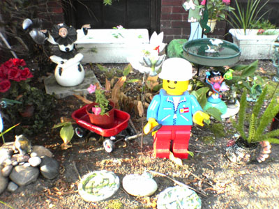
If I were in to garden gnomes
This is what I’d have.
I need to start a new category called Found On The Walk To The L.
Architectural spine
BusinessWeek just published their annual design awards. The Kansas City Public Library won one for their facade-as-library-shelf.
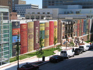
I knew I was on to something in this post, but maybe not quite so literally.
See also: Virtual flâneur
Always check the hitch
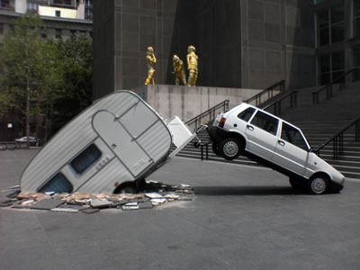
At the MCA.
Lincoln for our time
As New Yorkers and political activists around the country bicker viciously about the story of freedom to be told at Ground Zero, I was able to make a trip down to Springfield, Illinois last week to visit a freedom museum of a different sort, the newly-opened Abraham Lincoln Presidential Library and Museum.
I went in with low expectations, figuring that the experience would be either like the creepy robots in the Disneyworld Hall of Presidents or the imposing apotheosis of Lincoln at his memorial in D.C. It was neither. It was, in short, one of the best museum experiences that I have ever had. I’d highly recommend taking a trip down there to see it, if you can. The website is lackluster, but the buildings themselves are quite high-tech. Here are some highlights:
Ghosts of the Library – Think holodeck meets your local librarian. This might be the most interesting application of technology. The museum calls it “holavision” (blech), but it is really just projection that the audience views through a stage-wide pane of polarized glass. A real actor (the “librarian”, though with a twist that I will not ruin for you) interacts with a real set and with seemingly three-dimensional projections on the stage. The effect is very convincing. The most interesting part of this section is that the purpose of it is to explicitly address the connection between period documents/artifacts and the stories that are told in the museum. That is, they make a strong case for the importance of the seemingly inert collection of documents and artifacts and how they relate to the vivid stories that the museum tells. It is convincing and well-presented. Basically the credo of the Eternal Egypt project: using historical source materials (elements) to bring stories to life. (Also a great political trick, tying the importance of the library to the success of the museum.)
Hall of Whispers – A simple but moving hallway depicting the political invective that brought the country to the brink of the Civil War. This is done through period political cartoons and “whispered” broadsides that rain down on visitors as they move through zones of directional audio. The interesting thing is how the use of skewed lighting and off-center mounting of the cartoons create a disconcerting, almost unstable feeling as you walk through the hallway. (Some people get dizzy, apparently.) In other words, even if you don’t read or hear anything in the hallway you get the sense of a nation coming apart. A little spooky actually.
Lincoln-Douglas Debates – Controversial but fascinating, this exhibit uses a real television control room with multiple feeds going simultaneously to recreate these historic debates as if they occurred today. They have real news anchors (I remember Tim Russert, specifically) with fake infographics and news crawls (“Physicians discover substance called ‘germs’!”), and actors representing Lincoln, Douglas, and supporters yelling back-and-forth ala today’s news shows. You watch this from the perspective of the television room producer. Not sure if it completely works, but it certainly had children rapt in a way that the debates might not normally.
The Union Theater – An extremely high-tech theater with multiple proscenium-style stages, overlapping/moveable screens, rumble seats in the audience, and other special effects. The current programming there is a show called The Eyes of Lincoln that uses the actual depiction of the man’s eyes in photographs over the years as points of departure for explaining his life. It might seem a stretch, but it actually works. (Look again at his left eye. It wanders.) What I liked was the thought given to the actual subject-matter in such a high-tech theater. They could easily have gone all George Lucas on the thing and relied only on the smoke machines, but they didn’t.
Looking for Lincoln – Not a technology, per se, but interesting in that this program seeks to explicitly situate the museum exhibits in the context of other Lincoln sites around Illinois. Throughout the museum you are entreated to “look for” Lincoln at his home, law office, or other related structures around Springfield and elsewhere in Illinois. Likewise out in Springfield one encounters well-presented plaques that give background and direct people into the museum for more information. Sort of a dispersed regional tour embedded in the museum proper.
There are of course more traditional museum exhibits — artifact-based — but even these are nicely enhanced with technology, such as projected signage that is nearly identical to the actual printed signage on the walls. (You have to pass your hand in front of them to tell.) Overall the museum is about experiences and storytelling and the technology is used in the service of that. Critics call this Disneyfication. I think they’ve avoided the worst excesses of that label.
Lastly, lest my rah-rah for the museum make you forget that I am talking about downstate Illinois, I have included this photo of a hog truck pulled up right in front of the Futurama-Prairie Style museum building (seen from the rotunda of the library across the street). The old and the new.
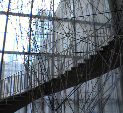
Tinkertoy iceberg
I finally got a chance to stop by the Art Institute last night to see an installation by Iñigo Manglano-Ovalle. The exhibit is a two-story nylon lattice fabricated from a radar/sonar scan of an actual iceberg off the coast of Newfoundland. Basically he’s taken a structure that is solid for a moment in time (it calves, melts, sinks, reforms), mapped it, broken it down to its wireframe, and created it using rapid prototyping techniques. The result is a complex natural polygon that floats inside a stairwell at the ARTIC.
Much of my work involves scanning artifacts that have not changed in eons in order to most realistically reproduce and preserve them. Which is why Manglano-Ovalle’s process — scanning an ever-changing structure to break it down to its basic geometry and build it back up — is a bit of an intellectual delight.
My friend Craig noticed this little detail. Manglano-Ovalle includes a 512MB memory key in the lattice. A docent noted that all the data from the iceberg scan is contained on that key.
As a bonus we popped down to see the stunning Photo-Respirations exhibit. Tokihiro Sato uses long exposure times, a flashlight (by night), and a sun-reflecting mirror (by day) to create eerie scenes puntucated with will-o’-the-wispy blurs of light. Definitely worth a look.
Thanks for the tip, Matt.
Mission Elapsed Time: 20:00:21:06:42:40

I went back through it this blog (and my Flickr account) on its 20th anniversary, retracing digital footprints made on what feels like a different planet. Here are some highlights.
The Terror Tourist
Explorations of place in horror fiction — real or imagined, geographical or psychological — culled from my time on The Heavy Leather Horror Show 2023-2026.
Subscribe to the podcast or the email newsletter or just read through the archives posted here.
The Ampcamper

How I hauled myself, two teens, an 80 lb dog, and a whole load of crap 4000+ miles across six states in twenty days using an electric vehicle. And survived to tell the tale.


