
That was fun, now everybody start sweeping
Though there’s still a corner of the building sticking up ominously from the rubble (bearing an unfortunate similarity to the shards that remained of the WTC after 9/11), the Sun-Times building is effectively no more. Mostly the activity outside my window is just cleanup of the mess. And ripping a building down does make one hell of a mess. I don’t need to pull the shades on the windows in the office there is such an impenetrable layer of filth on them.
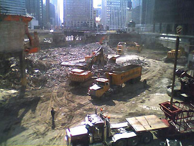
My sons came with me to see the heavy machinery this weekend. Predictably, they could not be pulled away. Not only was there blow-torching, aggressive hole-digging, and manly rubble-scooping going on, but they were constructing a mighty, towering crane which to me means that construction is soon to start. I swear we saw them dig out an old train car undercarriage from the muck. (Might make sense. Train tracks used to run along the north edge of the river.)
Here’s a video timelapse of the deconstruction through Feb. 11. Is it possible that I actually miss the jaw-jarring din of the last few weeks?
Japan scares me
First it was Ringu and The Ring, now Hollywood has remade Ju-On: The Grudge keeping only the subtitle. Both these movies are terrifying remakes of terrifying Japanese films. There’s no slashing, no crazed killer, no demonic possession, and few American horror genre clichés. Though neither movie is about technology per se, everyday items of technology are the primary means of effecting the kind of frights that I am coming to associate with Japanese horror filmmaking. For instance, both films use imaging technologies — photos, video, surveillance cameras, etc. — to convey that Something Is Very Wrong with the subjects of the shots.
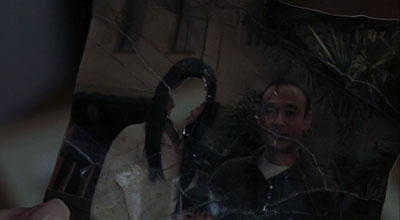
Photograph from The Grudge
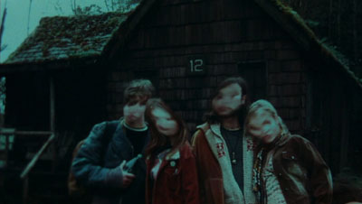
Photograph from The Ring
Phone calls figure prominently in both films too and, while this is not unique to Japanese horror, when you step back and look at how all technologies are used in the films it is clear that this level of remove — seeing the bad thing on a TV screen, hearing the bad voice on the phone, noticing the bad person in the background of a photo — are just contemporary versions of the old “spotting the killer standing behind you as you look in the mirror” trick. The fright comes from being one remove from the killer, having some kind of mediation between you and it, and knowing that that mediation offers a false sense of security. You still gonna die.
Maybe in the hyper-technologized culture of urban Japan this technology-as-mirror motif is the ultimate scare. Seems to be for me.
Barile
My great-grandparents came to America in 1903 from a small town called Barile in the region of Basilicata, Italy — basically the “instep” of the boot. I’ve visited Basilicata twice — more on that in an upcoming series of posts — and, though it has made much progress in the last ten years, I often find myself calling it the West Virginia of Italy. Rustic and mostly arid, many of the towns in the region are built on top of or straight out from sassi, the caves carved into soft rock that have formed the homes of inhabitants since well before Roman settlement of the peninsula.
Mel Gibson’s The Passion of the Christ was shot mainly in Matera, Basilicata, the town with the most striking sassi in the region. Shortly after seeing The Passion I learned that Gibson was merely following the Italian filmmaker Pier Paolo Pasolini in shooting a life of Christ in the region. In 1964, Pasolini released Il Vangelo secondo Matteo, a cinema vérité treatment of the gospel of Matthew using non-actors from Basilicata. I’ve read that Italian audiences actually demanded subtitles because the Albanian dialect of the “actors” was too difficult to understand. There’s absolutely no dramatic flourish in the film (a path Gibson diverged from in minute one of his film). This is Christ-as-peasant-among-peasants, seen from ground level. Call it Reality Hagiography.
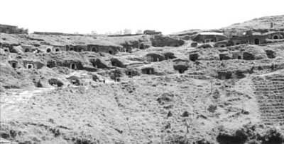
The sassi of Barile form the backdrop of the “slaughter of the innocents” scene. It is hard not to laugh at the centurions as they scamper up and down the hillside slashing at mothers and babies (some of whom fly out of embraces a little too easily). The film is likely to irritate modern viewing sensibilities for one reason or another, especially since the English dubbing is just awful. But I applaud the effort in the context of when and where it was made. If you’re going to shoot Christ as a man of humble origin you’ll not err in choosing Barile as a home town.
Compare the shot from the film above to a panorama of the same caves, now private wine cellars, taken last year.
Marginalia
I’ve been searching for a sideblog to post quick links to. I kinda knew it would have something to do with del.icio.us, so when I stumbled upon Veen’s recommendation to use it with the superbly simple RSS Digest I knew I had it. Check out the Marginalia column at right for updated niceties throughout the day.
Was This Information Useful? Yes | No
Reading Microsoft’s primer for parents who want to decrypt their kids’s computer slang is like listening to über-caucasian Bill Kurtis announce that the murder suspect also “did drugs and was into [dramatic turn to address the camera] rough sex.” It is just so overwhelmingly unhip that you are compelled to keep staring at the screen.
Among the terms that Microsoft highlights to help you “protect” your children:
“warez” or “w4r3z“: Illegally copied software available for download.
“h4x“: Read as “hacks,” or what a computer hacker does.
“sploitz” (short for exploits): Vulnerabilities in computer software used by hackers.
“pwn“: A typo-deliberate version of own, a slang term that means to dominate. This could also be spelled “0\/\/n3d” or “pwn3d,” among other variations. Online video game bullies or “griefers” often use this term.
Thank you, Microsoft. Now I finally have the tools to protect my family. Actually, it is a clever ruse. Big Brother masquerading as Beaver Cleaver. Aw shucks, did I just get h4xxored?
Have some art
Confession: I am an album art junkie. I can’t stand digital music that doesn’t have correct, decent-resolution album art embedded in it. (In graduate school one of my projects in multimedia design was a website for a future Museum of Album Cover Art. It was, as a recall, not exactly a masterpiece itself.) So, it would make sense that possibly the only real gripe I have with my beloved, unsupported, rapidly-becoming-an-antique Audiotron is that it has no capability for showing album art via its web interface nor does it have a video out to display album art on the TV set. Imagine my horror to learn that the iPod photo — which of course displays album art on its screen, hurray! — does not show said art via its TV out. I don’t want slideshows of my kids, damnit! I want to see the files that I so painstakingly embedded in my MP3 files! This seems so unlike Apple to me. Why black out the TV output when you are listening to music? (By the way, I am still waiting for the album art dongle thing.)
The news isn’t all bad, though. Recently TiVo released an SDK to developers for their Home Media Engine. (Yes, yes, too little too late, but let’s have fun while they implode, OK?) There are already a bunch of alpha-quality apps out there for it, and one of them will synch up with iTunes (on the Mac) and display the album art of whatever you are listening to on the TV screen. Clean, simple, nicely done.
By any other name
The NameVoyager over at Baby Name Wizard is just wonderful. The interactive graph plots the top 1000 baby names over the past century. The beauty of the interaction mode is that, as with search engines that start looking before you finish typing, NameVoyager dynamically re-draws itself with each letter of the name you input, allowing you to see variants and related name-forms morph through time.

This chart shows the popularity of names starting with ‘D’. Is there some cultural trend that can explain why the initial ‘D’ sound was so valued at mid-century but has been on the skids ever since? Whatever it is might explain why why mother and all four of her siblings (born in the later 1940’s and early 1950’s) all have names beginning with ‘D’. Or perhaps my grandparents — also with ‘D’ names — were just nutty about alliteration? And as long as we are searching for answers, what the f*** is going on with “F” names?
I was thinking about names today after I asked my son what the name of the “dog” he made out of Legos was. It occurred to me that I always ask him the name of things he creates or takes new possession of (like, say, a stuffed animal). He stops, recalls with some surprise that he has not named the thing, umms, and then usually produces a slight variant of the nearest tangible noun he spots. “Glass-y,” “Ball-oo,” “Rug-a.” Makes for some spontaneous, if un-memorable, names.
Amazingly, not a “byte” pun in sight
Food geekery article in the NY Times: “Using organic, food-based inks he concocts, Homaro Cantu creates a champagne, caviar and oyster dish and sushi rolls on flavored, edible paper made of soybeans and cornstarch.”
Next up: chic after dinner glue-sniffing. (And get back to me when you can actually print the sushi. That’s the 21st century I signed up for!)
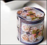
Virtual wiring
There’s a nifty little program called GraphEdit that I have been using to, um, “work with” the rights management in TiVo-To-Go files. The interface allows a virtual re-wiring of the audio and video inputs and outputs for a video file. For example, if you want to compress a video you would grab the output “lead” from the video and wire it to the input of a box in the chart representing whatever compression you liked. This interaction modality achieves in a single view the ideal of being both intuitive (out connects to in, and on and on) and completely explicit (the flow that you manipulate represents exactly what the program is doing). As a bonus it is also kinda fun. The bastard child of Storyspace and Media Cleaner.
I employed an interface like this for a piece of software I wrote in graduate school, but the links I allowed between video files implied sequence in time not transformation of one node by another. This distinction highlights a unique opportunity. What if you could link two video files to a single output file, creating a merger of the two? The links themselves could function as the transform filters — overlay, embed, distort, etc. Now that would be interesting!
I once played with a program that did visual transforms of images using a spreadsheet interface. You placed files into cells and then put together formulas — essentially filters, as in Photoshop — between the cells. The resultant file in a new cell was your output, just like spreadsheets work. (Anybody know what this program was called?)
Whose skills?
I am on the L tonight. The man next to me is reading a printed Powerpoint deck on his lap. Three points per page. No more than a few words per line. Like a set of flashcards or a very large type edition of a book. Except that the storyline has been broken down into bullets. I think maybe he is doing foreign language drills or something. It all looks very See Jane Run.
I peer closer. The subject matter is serious indeed. The deck is a school board report instructing teachers on how to raise the abysmally low reading skills of their K-3 students.
• I wince at the irony.
• I think of Tufte.
• I exit at the next station.
Mission Elapsed Time: 20:00:21:06:42:40

I went back through it this blog (and my Flickr account) on its 20th anniversary, retracing digital footprints made on what feels like a different planet. Here are some highlights.
The Terror Tourist
Explorations of place in horror fiction — real or imagined, geographical or psychological — culled from my time on The Heavy Leather Horror Show 2023-2026.
Subscribe to the podcast or the email newsletter or just read through the archives posted here.
The Ampcamper

How I hauled myself, two teens, an 80 lb dog, and a whole load of crap 4000+ miles across six states in twenty days using an electric vehicle. And survived to tell the tale.


